Canadian packaging has nothing to hide
By Rhea Gordon
Design & Innovation Sustainability Design Glass Brutus Beverages Inc. Fiasco Gelato google Loblaws Inc. Mad Mexican Artisan-made Nacho Chips Mad Mexican Foods Limited Redpath Sugar Limited Walter Craft Caesar MixA monthly look at some of the hits and misses in the packaging world from the viewpoint of Joe Public, Canadian Packaging magazine’s revolving columnists. From the June 2019 issue.
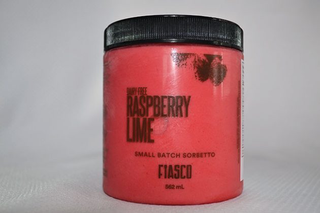
Proudly creating delicious frozen treats in Calgary, Fiasco Gelato is a poster child for product transparency with its 562-ml see-through semi-rigid jars filled to the top with hand-crafted, small batch gelatos and sorbettos available in raspberry lime, dark chocolate caramel sea salt, mango pineapple and other decadent flavors. There’s no wondering what’s inside boxes, cartons or tubs, or if a photo matches the product, as the shopper gets treated to a full view of delicious contents inside the clear container. Moreover, the screw-top lid is a cinch to open despite spending time in the freezer. Fittingly, the in-mold product label carries just enough product information to meet required nutritional disclosure, while using sparse graphics and lettering to let the colourful dairy-free product inside to get the company’s ‘See what’s inside, we have nothing to hide’ brand message stand out with optimal clarity.
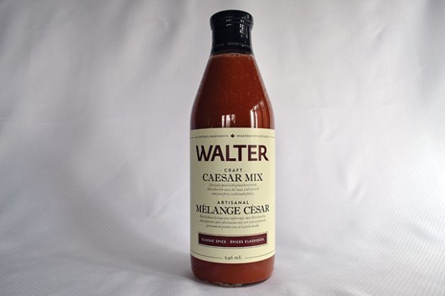
Further out west in Vancouver, meanwhile, Brutus Beverages Inc. cleverly displays its packaging savvy with the 946-ml glass bottles of the Walter Craft Caesar Mix blend of all-natural ingredients that include grated horseradish and clam juice sourced from a certified sustainable fishery. The bottle’s catchy label includes a tiny maple leaf at the top of the on the front and a ‘Proudly made in Canada’ tagline on the back—giving consumers an option to display their patriotism with a Canadian product purchase. Moreover, displaying the word ‘artisinal’ in all-caps to separate the English and French ingredient listings on the front label projects genuine authenticity of pure craftsmanship invested into the tasty beverage, as does the black tamper-evident band applied around the metal cap. The beige background label provides sublime color contrast against the reddish-brown contents, while the textured paper used for the label not only helps one grasp the round bottle with ease, but also creates a stylish rippling effect with thin horizontal lines forming on the label’s surface when exposed to the light. To use an irresistible pun, “Hail Caesar!” for a packaging job well done.
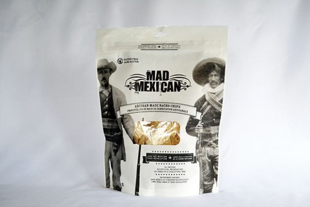
Back here in Toronto, Mad Mexican Foods Limited is all caught up in revolutionary fervor with its Mad Mexican Artisan-made Nacho Chips brand of gluten-, cholesterol-, transfat- and artificial preservative-free triangular corn crisps. Packed in 250-gram stand-up pouches incorporating a reclosable Freshness Seal and a see-through
cutout window, the perfectly-shaped nachos inside are decorated with stunning graphic reproductions of black-and-white photos of Mexican gunslingers as depicted in old-school Hollywood westerns of the bygone era, along with a daring invitation to “Join the Mexican Food Revolution.” It’s all tongue-in-cheek stuff, of course, but this all-guns-blazing approach to packaging design is a captivating display of genuine passion for product authenticity and craftsmanship.
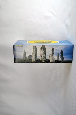
Every season has a good reason to have a box of paper tissues nearby, and every tissue box needs punchy and engaging graphics to complement one’s individual style, decor, taste and occasion. That said, there is limit to the amount of graphic images of flowers, plants, cute kittens and puppies, swooping birds, shiny snowflakes, trendy geometric patterns and other such safe but long-in-the-tooth design trappings that anyone can take without losing the original ‘Wow Factor.’ Surprisingly, it is the no-name brand of tissues from retail giant Loblaws Inc. that is shaking things up with a box that absolutely “rocks,” both literally and figuratively, by depicting a photo of a real-life ancient Celtic stone circle dramatically reaching upwards to the sky and the gathering clouds above. While there is no mention of the actual location of this rock formation anywhere on the box, a thorough
Google search revealed the closest match to be the Callanish Stone Circle in Scotland’s Isle of Lewis, Outer Hebrides. The mere fact that a simple box of paper wipes can arouse enough curiosity to do follow-up research makes a compelling statement for the virtues of using images of real-life monuments and other such wonders of the world for certain products, rather than generic illustrations of flower fields and ocean sunsets that could be found just about anywhere and everywhere.
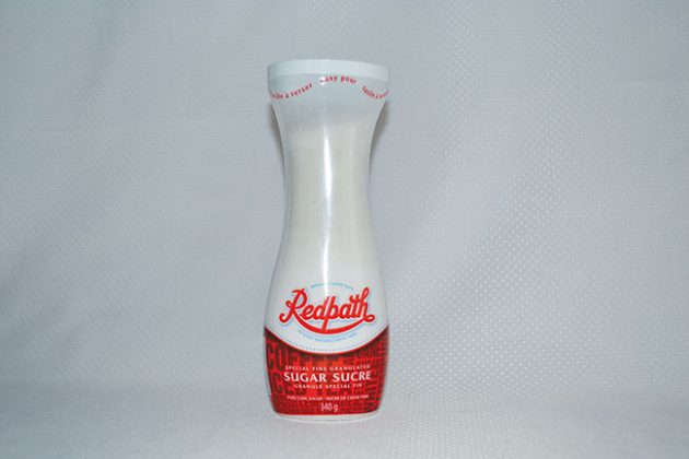
For a company that seems to have been around forever, Toronto-based Redpath Sugar Limited has a remarkably youthful high-energy mindset when it comes to packaging innovation, with its new 340-gram easy-pour hourglass plastic dispenser putting a whole new twist on consumer convenience and brand loyalty. Easy on the eyes and easy to use, the container is decorated with a full-body wraparound plastic sleeve that can be easily peeled off without leaving any adhesive residue alongside the shapely container, which can also be refilled time and time again to keep the handy contraption a permanent spice-rack feature for as long as you wish. Sweet!

Rhea Gordon is a freelance writer living in Toronto.
Advertisement