GON AND DONE!
George Guidoni
Design & Innovation Design Flexibles Paperboard Packaging Plastic Bug B Gon Pigeon Brands Inc. Scotts Canada Ltd. Scotts Miracle-Gro CompanyComprehensive brand relaunch ticks all the right boxes with a compelling package design helping consumers navigate through a complex and chaotic product category
Humans and insects don’t make for good housemates. Never have, never will.
In fact, keeping nasty bugs at bay may well be one of humankind’s most ancient painstaking chores that, for many reasons, amounts to an endless war of attrition.
And while it’s true that only a mere fraction of all living insects gives the entire species a bad name and reputation, that’s little consolation to millions of Canadians overwhelmed by the seasonal arrival of ants, earwigs, spiders, beetles, wasps, mosquitoes and other unwanted creepy-crawly houseguests at the first signs of spring.
Happily for them, there is no shortage of commercially available insecticides and other bug repellents widely sold across Canada to help them deal with the seasonal onslaught, thanks to companies like Scotts and other producers of pest control products formulated to help keep the nuisance insects at arm’s length, at least.
However, this ready availability and multitude of choices can often translate into consumer rage at the shelf level because shoppers often have a hard time selecting the most effective remedy for their specific insect issues on their own, in a reasonable amount of time.
“Historically, this is the one product category that has caused the most confusion among consumers, resulting in one of the biggest walkaway rates for any product category,” says Glenn Martin, director of marketing at Scotts Canada Ltd., Canadian subsidiary of multinational manufacturer of lawn, garden and home protection products Scotts Miracle-Gro Company.
“The insect control category has a plethora of both large and small competitors, and that’s part of the problem,” Martin told Canadian Packaging during a recent visit to the company’s head offices in Mississauga, Ont.
“Unlike lawn and garden products, where you see big bags of similar products from two or three companies to choose from, you may be looking at seven or eight different insecticide product brands on a single shelf, offering three or four different ways to kill wasps, for example.
“So it can get very frustrating to find a solution that you need to remedy your specific problems,” Martin explains. “When you find yourself looking at the sea of colors and images, and there’s no knowledgeable store staff nearby to help you out, it’s very easy to get lost and exasperated.”
Whereas in the past insecticide producers skimped around the issue by offering more general-purpose formulations to repel a broader variety of bugs, “This one-size-fits-all approach was actually part of what caused all the confusion at the shelf level from a consumer standpoint,” Martin asserts.
“There is a strong emotional connection between consumers and these types of products because they are trying to resolve a problem that can potentially cause harm to themselves, their family or their home,” Martin explains.
“So they don’t want to buy a product that ‘might’ work,” he states. “They want to buy a product that will work the first time and every time thereafter.”
A couple of years ago, Scotts Canada resolved to turn this marketing shortcoming into an opportunity to establish a stronger and more unified shelf presence for its products through a comprehensive relaunch of its once-popular
Bug B Gon brand of insect control solutions.
“We were struggling to have a real impact on the shelves and grow our business, so we decided to do a brand relaunch project,” Martin recalls.
“And rather than start from scratch, we decided that we already had an asset with brand equity with the B Gon brand, so we decided to bring it back in a much more powerful, modern and aggressive way.”
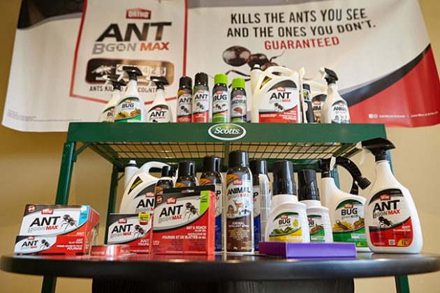
With a strong family look and shopper-friendly shelf navigation facilitated by the new eye-catching package design, the relaunched Bug B Gon line of household insect control products, comprising 26 different stock-keeping units and a diverse array of packaging materials and components, has already achieved a 50-percent increase in point-of-sale numbers over the last year.
As part of the extensive effort to return Bug B Gon back to Canadian retail channels—where the brand once enjoyed notable success in the mid-2000s—Scotts commenced rapid development of several new effective formulation targeted at specific bug species, as well as more innovative and user-friendly ways of applying them.
“We have done a lot of product innovation in the last couple of years, which notably includes finding a way to package diatomaceous earth inside aerosol cans, as well as developing animal repellents to ward off problem raccoons, deer and other nuisance animals through learned behavior,” says Martin, citing new types of spray, gel, liquid, foam, powder and other product varieties, along with novel dispensing mechanisms such as prefilled syringes and handheld wand applicators.
“The main idea was to provide more efficacious products and more innovative application technologies to make those products easier to use and apply to the problem areas.”
Martin relates that Scotts released the first wave of reformulated B Gon brand products into the market last year, with many more others being launched into the market this spring to maximize the initial stellar success that, according to Martin, is a direct result of the superior package design work for the brand expertly executed by leading Canadian branding consultants Pigeon Brands Inc.
Having had considerable prior professional experience working with Pigeon Brands for over 20 years, Martin says he knew his marketing team would greatly benefit from working with a renowned design agency that has worked on thousands of brand launches and relaunches over the last 42 years—creating a vast track record of outstanding packaging designs for a multitude of SKUs (stock-keeping units) for well-known consumer brands every year.
And with the relaunched B Gon brand being ultimately expanded to comprise 26 different SKUs—packaged in a diverse range of formats, substrates and sizes—Pigeon Brands founder and president Thomas Pigeon also knew that his company had a fairly unique and intense creative challenge on its hands.
“Working in a multi-SKU environment in a complex product category, subject to many regulatory requirements, was a different proposition from a lot of our other work we have done for food and beverage brands,” says Pigeon.
“It’s a lot different from other CPG categories where you want to take it slow and nurture the product experience that consumer has with the packaging.
“This is a real ‘get-in, get-out’ kind of category, where you have products intended to make a significant problem go away as quickly as possible,” Pigeon explains, “so your packaging has to be able to let consumers to locate the solution to their problems as fast as possible.”
As Martin reiterates, “This being a real problem-solution category—be it problem ants, wasps, mosquitoes or whatever else—you want to find a quick solution that’s going to work immediately after the problem has been identified.
“The impetus for us was to take a very intuitive brand that still had tremendous consumer awareness and acceptance, and bring it back in a way that really made sense to the consumers by helping them to navigate the shelves, whereby package design would do all the heavy lifting,” Martin explains.
“So if you have a wasp problem, let’s say, you can immediately locate the solution you’re looking for at the store by looking at the hero bug (wasp) image on the package for easy navigation.”
Says Martin: “We needed to create a common family look across a number of different product iterations within the category, but with enough product differentiation, through distinct colors and graphics, that would also make the sub-brands stand out on their own on-shelf and, eventually, online as well.”
Adds Pigeon: “All new projects at Pigeon begin with a full discovery phase, with context being such an important part of a strategic design.
“And because we haven’t worked in this space before, this phase was even more important this time around, as we had to immerse ourselves in the market dynamics to make sure we would create a compelling idea and design to drive sales.”
After that market familiarity was established, the Pigeon design team and Martin’s marketing staff began evaluating all the different design strategies to achieve the intended result, ultimately settling on the “Be big, be bold” approach proposed by Pigeon Branding.
“The Bug B Gon portfolio is a brilliant brand with a brilliant trademark,” Pigeon explains, “but it needed navigational simplicity that would allow consumers to find the product they need through quick understanding of the product via the packaging,” Pigeon explains.
“Hence the use of big bold images of the hero bugs; contrasting colors for strong product differentiation for each of the specific bugs targeted by the product; bold and simple typography to make it easier to read; and unique visuals that would be able to talk to all the demographics.”
As Pigeon points out, “In a multicultural environment like Canada, many consumers may be new Canadians with a different cultural set, speaking different languages.
“Hence the big graphic images of the mosquitoes, wasps, ants and earwigs become the icons that facilitate virtually global understanding and navigation of the brand message being communicated.
“One of the biggest driving principles at Pigeon Branding is creating ideas that travel,” Pigeon states, “and that’s where the big bold insect graphics play a key role.
“Naturally, you have to consider color, typography, iconography and photography as parts of a larger toolkit to use when building any brand,” Pigeon acknowledges.
“But at the end of the day you want to project a core idea with a core set of symbols and values that can travel through the brand’s entire eco-system with a harmonized, systemized and disciplined brand identity,” he states.
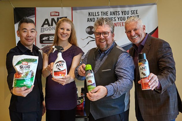
From Left: Pigeon Brands group account director Terence Tse, Scotts Canada brand manager Lindsay Lemierzewicz, Scotts Canada director of marketing Glenn Martin and Pigeon Brand founder and president Thomas Pigeon strike a cheerful pose with some of the B Gon brand products retailing in high-impact packaging designed by Pigeon Brands in close collaboration with Scotts Canada’s marketing team.
“In this instance, where you’re dealing with a lot of visual chaos and clutter on the retail shelf to cut through, iconography trumps photography any day of the week.”
Martin concurs, pointing out that the hero bug graphics developed by Pigeon to decorate the different products are now widely used as key consumer touchpoints for all the promotional efforts used to market the B Gon brand, including television, social media and other communication platforms.
“As the product line-up kept expanding throughout the whole design process, we were able to adapt those graphics to carry a consistent brand message on just about every packaging material out there,” says Martin, pointing out the expansive range of packaging materials and components incorporated into the B Gon masterbrand.
“Pigeon enabled us to take those graphics and apply them to folding cartons, blisterpacks, flexible pouches, aerosol cans, polybags, pressure-sensitive labels and so on, while arranging them so that they look consistently strong and powerful on metal, plastic, paperboard or just about any other packaging substrate out there,” he says.
“That was probably the biggest design challenge—having a powerful master design and making it work across all the different permutations and color combinations, while also accounting for all the different sizes, shapes and structures.”
Naturally, none of this happened overnight.
“This project unfolded over many months,” Pigeon recalls, “involving tremendous amount of creative talent at Pigeon, a lot of walking through many different store environments, and constantly dialoguing with Glenn and his marketing team—often pushing back and challenging each other on some of the ideas put forth.
“But the net result,” Pigeon proclaims, “is an effective design system that will survive for this brand anywhere on the planet, and win against any competitor on the shelf.”
Says Pigeon: “Great brand design only happens if you have a fearless client who allows you to do great things.
“It takes a great strategy, great thinking, and great insights to create a great collaboration,” he concludes, “and Glenn and his team have been exemplary in facilitating the successful outcome of this project.”
For his part, Martin is full of praise for the high level of creative talent and tireless dedication to the cause demonstrated by Pigeon Brands throughout the entire endeavor right from the outset.
“In all the years I’ve been in marketing and out of all the different businesses I have worked for, this is probably the strongest and most impressive brand relaunch I have ever been involved in,” Martin extols.
“We are thrilled to be able to stand back and look at this whole broad range of products that works so well as a family, but still maintaining a unique identity for individual packs so that they do not get lost on the shelf amongst each other or competitors,” he states. “We saw our POS (point-of-sale) numbers surge by 50 per cent as a result of the Bug B Gon relaunch,which is pretty hard to do for any product in this day and age.
“Moreover, the new design has also had a huge impact in terms of product listings, with most retailers now listing our products across Canada,” Martin points out.
“For all that, package design that can’t close the deal at the shelf level is not worth its salt,” Martin concludes, “and we have seen huge gains in the last year since this new package design was introduced into the market—enabling us to close the deal better than we ever had before.”
Advertisement