Subtle packaging that works wonders
By Megan Moffat
Design & Innovation Design design Happy Planet Foods Kleenex Liberté Organic method Hand SoapA monthly look at some of the hits and misses in the packaging world from the viewpoint of Megan Moffat, Canadian Packaging magazine’s revolving columnists. From the November 2018 issue.
Consumers often tend to judge a product they have not bought before solely based on the look of the packaging. Whether the packaging is used to convey a message or attract attention, it’s all about buyer intrigue—thinking outside the box and sharing the story surrounding the brand. Critically, brands are starting to recognize that consumers want to like their packaging as much as they like the product. While it’s the inside that counts in the end, consumers still need a little extra pizzazz to draw their attention from the other competitors. Different types of visual illustrations can be used to highlight a brand’s product while still conveying important information to the consumer. Here is a sampling of a few products that make effective use of shapes, colors and lines turns to turn heads and draw the customer’s eyes towards the brand.
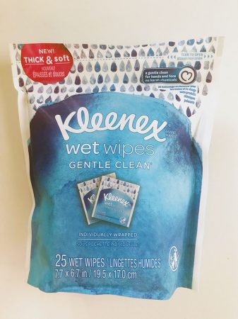
Because it is one of the most recognizable brands on retail shelves anywhere in North America, I was intrigued to see something different other than the usual standard tissue box we’ve grown accustomed to from Kleenex. For someone who is perpetually stuffing facial tissues or restaurant napkins into her pockets during the flu season, it a was joy to Kleenex now offering individually wrapped wet wipes inside a resealable stand-up pouch for total consumer convenience on-the-go. While still boasting the soft and thick texture of the popular facial tissue, it’s the calming illustration on the front panel of the pouch that draws the initial
attention. The blue watercolor palette generates an aura of ultimate relaxation, while the ombré effect created by illustrated raindrops perfectly complements the brand’s renowned soothing nature by projecting sense of placid tranquility and purity. The abstract nature of the packaging entices consumers to take them along to their favorite peaceful place—be it a good book and a warm blanket, Tuesday night hot yoga, or even a walk in the rain.
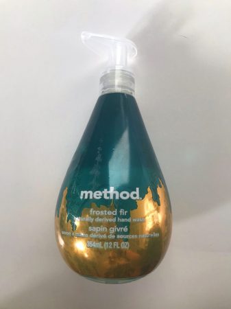
Taking the art of abstract illustration in a modern direction, the method Hand Soap brand has become a rapidly-growing brand in large part due to its appealing visual aesthetics and a resoundingly eco-conscious message. Paraben-free, biodegradable, never tested on animals, and 100-per cent recycled plastic packaging structure all make a compelling statement about this product’s mission to help keep you clean
without hiding any dirty little secrets. Moreover, the bottle’s pear-shaped design provides a perfect canvass for mixing a varied array of colors to suit the brand’s diverse selection of scents—perfect for sprucing up any bathroom shelf. Released just in time for the upcoming holiday season, the new Frosted Fir scent really rouses the holiday spirit with its gold foil and subtle pine-tree graphics set against the forest-green wraparound shrinksleeve label. The end result is a genuinely elegant container without all the busy bells and whistles found in most holiday-themed packaging. Kudos to method for its relaxed, watercolored
approach to packaging design that projects a calm sense of peaceful purity and serenity to put the consumer at ease with the world.
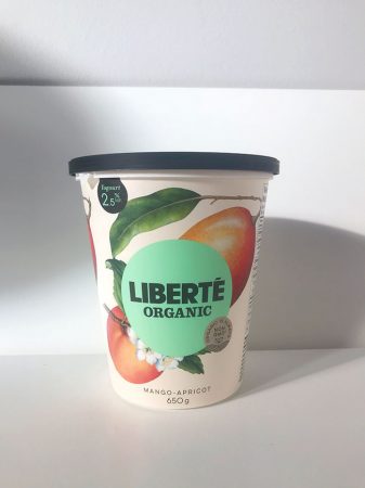
As you may have guessed, I am a big fan of subtle design tweaks in packaging, rather than radical reinvention of the wheel just for the sake of it. In this light, the recently redesigned packaging for the Liberté Organic line of Greek-style yogurt hits all the right notes with its natural approach to decorating the high-quality dairy favorite. Boasting beautiful graphics fruit graphics of fresh fruit in its natural state to spruce
up the cram-colored background, the 650-ml container of the brand’s delicious Mango & Apricot flavor variety is a real breath of fresh air in the aisles among the rows of mostly ‘me-too’ yogurt tubs crowding the dairy section shelves. Simple and elegant, the botanical sketch effortlessly conveys the timeless nature of the product with its high approachable and personable packaging that captures the product’s taste and overall attention to detail without having to resort to digitally-enhanced product photography that has become the norm for most mainstream yogurt brands lately.
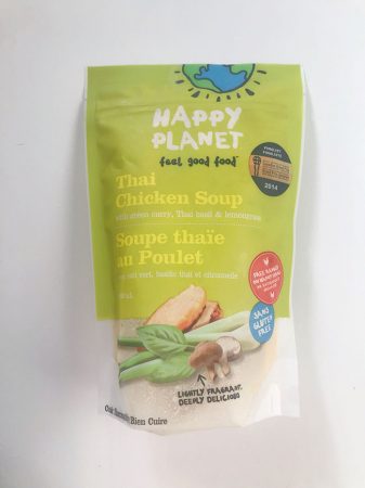
Another clever alternate approach to picture-perfect packaging décor is the useof intentionally child-like graphics to make an instant connection with the consumer. Produced on the West Coast by the Burnaby,
B.C.-based Happy Planet Foods, Inc., the Happy Planet brand of all-natural gourmet soups happily laps it up with the cartoonish logo of planet earth created by simple sunbeam marker strokes—located in
the tear-off portion of the stand-up plastic pouch just above the resealable closure. The whimsical motif is repeated with the brand logo, tagline and the three other product callouts featured on the 500-ml
pouches of the Thai Chicken Soup flavor—each employing kindergardenish scribbles to relate the product’s attributes in plain and simple messaging that even a child can easily understand. It’s all very disarming and transparent—especially with the bottom half of the pouch being left clear to let consumer actually see the contents inside in true “nothing to hide” fashion. Using a high-quality photograph of lemongrass, ginger, and mushrooms—provides an open invitation for consumers to really think about what’s in their food. All in all, it’s a very tasteful departure from the usual round metal cans that most soups are still packaged in—making a perfect marketing pitch to happy-go-lucky consumers to leave the shop with some wholesome goodness to bring home.

Megan Moffat is a freelance writer living in Toronto.
Advertisement