The Art Of Winning—January/February 2018, Canadian Packaging, PAC Connect 2018
By George Guidoni, Editor
Design & Innovation 2017 Canadian Leadership Awards Bulletproof Cannes Travel Retail Awards Davis Grant’s Elementary Carbon Grant’s Elementary Oxygen Grant’s Elementary whiskey iÖGO yogurt PAC Global Leadership Awards PAC Packaging Consortium PizzaExpress PizzaExpress Classic PizzaExpress Romana slideshow Ultima Foods Webb deVlam William Grant & SonsThe Art Of Winning—January/February 2018, Canadian Packaging, PAC Connect 2018
Caption: PAC president and chief executive officer James Downham (left) presenting the 2016 Best of Show Global Leadership Award to Ronald de Vlam, founder of the Webb deVlam group of companies, for the outstanding package design work on the Grant’s Elementary range of whiskies.
For today’s package designers, producing a package to protect a product is often the starting point of a creative journey to engage the brand with modern-day consumers who increasingly judge a package on what it means and represents almost as much for what it contains.
The late great Apple founder Steve Jobs once deftly observed that “Packaging can be theater, it can create a story,” and for all the new ways that leading consumer brands have at their disposal to make their sales pitch, there is still no substitute for actually having a good story to tell on the product’s packaging.
In the Canadian food industry, one of the biggest stories of the past decade has been the meteoric growth of the yogurt product category that helped many innovative dairy producers to thrive in spite of the fairly flat growth for dairy products as a whole.
Nowadays retailing in a dizzying array of flavors, sizes, textures and styles, it is hardly surprising that the North American consumers’ blossoming renaissance with yogurt products has coincided with some groundbreaking design work done by companies like the Mississauga, Ont.-based branding services agency Davis.
According to the company’s president Ron Davis, taking on the challenge of updating an existing package design of the popular iÖGO range of yogurts, produced by the Montreal-based dairy products group Ultima Foods, was a thorough test of the company’s creative prowess and credentials.
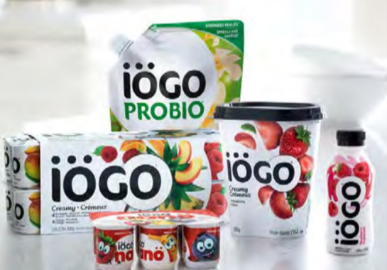
Featuring engaging new packaging design and graphics developed by leading Canadian branding and package design services provider Davis, the iÖGO brand of Ultima Foods was the Best of Show winner at last year’s Canadian Leadership Awards competition.
Taking about eight months to complete, the project had to navigate through a vast realm of interlinked nuances, talking points, design elements and a multitude of other critical variables one would expect from a growing brand family comprising more that 100 different SKUs (stock-keeping units), according to Davis.
“The yogurt category is one of the most complicated, with lots of new innovation and changing consumer preferences,” Davis explains, citing the broad range of packaging formats— including bottles, tubs, pouches and cartons—entailed in the packaging refresh for the brand.
Launched across Canada in 2014, the iÖGO brand quickly became a brick seller and category leader in the Canadian marketplace, with its distinctive playful graphics and lettering helping create a lot of positive buzz at the shelf level and in the dairy aisles.
But with initial excitement of the launch slowly fading, Davis was brought on-board in 2015 to inject some additional marketing momentum into the brand for a comprehensive rethink of the original packaging elements, without a radical departure from the basic premise of emphasizing the product’s superior flavor, freshness and the use of real natural ingredients.
“So our challenge was to deliver this in a way that was distinctive at shelf and distinctively iÖGO,” Davis recalls.
“The previous design did a great job of communicating iÖGO at the shelf by being playful and distinctive,” Davis says, “but as the brand innovated, some new product lines and offerings were not being found at the shelf.
“With a highly unified design system, the different products looked too similar,” he says, “which limited consumer awareness and shoppability of distinct product lines.”
With the creative use of Germanic umlauts in the iÖGO brand name acknowledged as a key graphic branding element to draw the attention of children and their parents to the single-serve iÖGO Nano products intended for the younger demographics, Davis decided to reinforce the brand’s identity by extending the iÖGO typography into the brand’s products aimed at adults.
“The redesign focused on the shoppability concern,” explains Davis, citing the identified need for a more holistic approach that would also allow the individual iÖGO subbrands to have their own say on the shelf for more effective distinction between the category segments.
“The brand had to retain its prominence,” he says, “but we also needed to create awareness of the multiple segments the brand was delivering to the market.
“The fact is that iÖGO is not a ‘kids-only’ or ‘classic yogurt’ brand,” he notes, “and so the new system needed to clearly communicate the brand’s vast variety of offerings to the consumers.
“With one of the largest ranges of products in the yogurt category, iÖGO’s offering required a powerful and consistent brand platform to create a unified masterbrand, while at the same time be able to strongly differentiate the various product lines—like Probio, Greek and Nano—to help consumers shop the category,” says Davis, noting the various creative possibilities offered by the hip lettering in the iÖGO name, specifically the triple-dot accent effect over the first two letters of the brand name.
“As the most recognizable part of the iÖGO identity, the umlauts were the inspiration for the final design system and a critical unifier at shelf,” Davis explains.
“All packs leverage an “umlaut” in some way—be it encircling the O of iÖGO in the core line, or housing the iÖGO brand logo in the more specialized offerings.”
Adds Ultima Foods vice-president of marketing Simon Small: “While the original iÖGO packaging was not broken, we knew there was tremendous potential if we could dial up landmarking on shelf, as well as articulating the subbrands and special offers.
“We selected Davis for their category, architecture and design insight,” Small relates, “and they proved to be a tremendous partner as we challenged ourselves and previously perceived brand assets, not to mention timelines, to deliver simply stunning results.”
Fittingly, those results drew the highest possible praise in the Canadian packaging industry several months ago, with the redesigned iÖGO packaging being recognized with the PAC Best of Show award in the 2017 Canadian Leadership Awards national packaging competition of the country’s leading packaging industry group PAC Packaging Consortium.
According to Davis, “The iÖGO brand is a great example of mastering tensions in branding.
“When you get that right on you get the ‘dramatic simplicity’ you need to help the brands achieve maximum impact with minimum effort.
“Designing to balance that tension achieved strong business performance for Ultima Foods,” Davis relates.
Ultima’s Simon Small concurs: “The brand and pack restructure was a tremendous project on many fronts—most importantly, results.
“The Davis team delivered a highly shoppable refresh with a disruptive restructuring of the portfolio that resulted in improved store and in baseline sales.”

Bulletproof’s global creative director and partner Nick Rees spearheaded the comprehensive package redesign project for the popular PizzaExpress brand of chilled pizzas and side products at the global branding and design agency’s European offices (inset) in London, England.
If helping consumers navigate the shelf easier and livelier is a hallmark of effective package design, then the London office of global brand and package design services group Bulletproof has certainly raised the bar with its stunning packaging update for the premium-quality PizzaExpress brand of chilled take-home pizzas retailing in the U.K.
Selected as winner of the Best of Show Brand Marketing Award in last year’s PAC Global Leadership Awards competition of PAC Packaging Consortium, the stylish litho-printed carton board sleeve pizza boxes ooze with upscale sophistication created by a masterful blend of vivid colors, life-like product photography, witty messaging and high-end matte, gloss and foil finishes to create an irresistible visual hook at the shelf level.
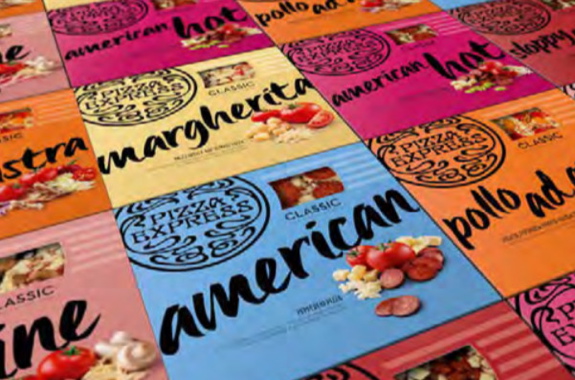
The new carton design for the PizzaExpress Classic line of chilled pizzas featured introduction of bold colorways to provide consumers with easier navigation at the shelf level through effective product differentiation between the brand’s different recipes.
Nowadays operating over 500 restaurants across the U.K, Europe, China, India and the Middle East, brand-owner PizzaExpress was founded in London’s trendy Soho district in 1965 by Peter Boizot, a well-traveled reporter with a fierce passion for Italian cuisine.
With the original Soho location still widely revered by local and traveling foodies to this day, the company’s eventual entry into the retail market was a natural step for an iconic brand celebrating its 50th anniversary, but its initial foray onto supermarket shelves did not live up to high expectations.
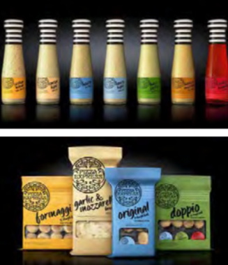
In addition to redesigning the pizza cartons, the Bulletproof team also developed new packaging for the brand’s complementary side products such as dressings and flavored breads, with sales for both products ranges soaring right after their U.K. market relaunch.
“When PizzaExpress approached Bulletproof to redesign their retail range, take-home chilled and frozen pizza growth in the U.K. had slowed to two per cent, compared to 4.2 per cent for the year before,” says Bulletproof ’s global creative director and partner Nick Rees, noting that private-label pizza brands accounted for a giant 87.5-percent share of the entire chilled-pizza segment.
“The lack of standout shelf impact and unclear navigation was hitting premium brands, including PizzaExpress, particularly hard.”
As Rees relates, “The PizzaExpress brand targets affluent 24- to 45-year-old consumers from the southeast of England with a taste for the finer things in life.
“We characterized them as ‘Social Life Jugglers’—sociable, outgoing consumers who seek quality convenience, prefer food with an authentic story, and view taste and freshness as paramount,” Rees explains.
To reach this coveted demographic, Bulletproof was briefed to redesign the PizzaExpress ‘At Home’ range as part of a new one-brand strategy that would:
- Deliver a consistent retail brand identity to attract restaurant customers;
- Bring to life the passion, flair and taste of the restaurant experience to home;
- Entice new customers through stronger shelf visibility;
- Deliver premium packaging to help justify the higher price point and encourage purchase off-promotion;
- Create a tiered design system for classic and premium ranges, with options for future new product development and brand expansion;
- Develop clear and coherent flavor navigation at a range level, while ensure a consistent visual identity across multiple product ranges including pizza, bread, pasta and dressings.
Working closely with the client and key packaging suppliers, it took the Bulletproof team about 10 months to complete the extensive and complex project involving a launch of two new pizza variants—Classic and Romana—as well as complementary toppings and side-dishes like garlic bread.
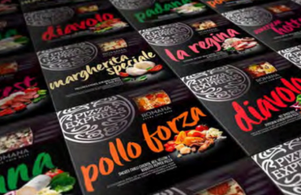
Bulletproof designers selected a black palette for the PizzaExpress Romana range of chilled pizzas for maximum visual impact of special finishes such as gloss varnishing and foiling.
By all accounts, it was time very well-spent, according to Rees.
“Throughout the whole redesign, we were heavily involved in the print process—from early initial key meetings with suppliers to attending print runs—which really helped to enforce our vision for the finished product,” he recounts. “Having a really supportive client working closely and collaboratively with us on every stage of the process helped immensely,” Rees states, noting the extra degree of complexity of meeting varying launch deadlines for the PizzaExpress Classic and PizzaExpress Romana product ranges.
“Each of the product ranges had a different lead-time, so we carefully managed the creative process to ensure the design development was considered holistically, and consistently, throughout,” he says.
“In the end, this helped achieved an impactful launch of the revamped PizzaExpress retail offering that will stand the test of time.”
Once launched, the new nine- and 12-inch PizzaExpress cartons generated immediate impact and excitement in the chilled and frozen food aisles, Rees relates.
“We captured the heritage and exuberance of the PizzaExpress story with a masterbrand proposition which heroed the core assets of the brand,” Rees explains, “while also leveraging the warmth, passion and artisanal detailing of the restaurant experience.
“The bold colorways for PizzaExpress Classic made for easier, more convenient navigation at the shelf level,” he expands, “while the handwritten typography was designed to feel authentic, yet playful and approachable.
“The new packaging helped creating a beacon of color in-store,” he says, “capturing the warmth and approachability of the PizzaExpress brand and demanding consumer attention by flexing the background color to reflect each flavor variant—creating a sea of color in the chilled pizza fixture.
“It’s a world away from the darker, more recessive color palette of the previous packaging,” says Rees, noting the intentionally downsized cutout windows on the front panel of the box to display the contents.
“Shunning category norms for large product windows, we significantly reduced the size of the windows on our pizza packaging, instead using our mouth-watering photography to showcase that these pizzas contain the same fresh, delicious ingredients enjoyed in PizzaExpress restaurants,” he explains.
“Moreover, we used the smaller on-pack windows to enhance the cartons’ structural integrity,” Rees points out.
“The previous pack with larger windows was structurally weak and, as a consequence, was susceptible to tearing.”
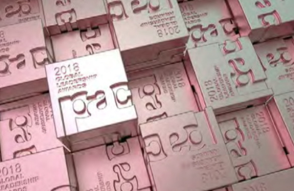
PAC Packaging Consortium created the annual Global Leadership Awards competition three years ago to recognize and celebrate the best new packaging designs from around the world.
As for the companion PizzaExpress Romana range, comprising six tantalizing recipes, “We looked to incorporate special finishes, such as gloss varnishing and foiling, to make the new packaging feel more premium from a value-added perspective.
“We selected a black palette for the Romana range, with product color introduced through typography to clearly communicate the variant,” he explains, “while using silver foil on the branding logo, as well as matte and gloss varnish, to further ‘premiumize’ the packs.”
Rees says the new Romana boxes enabled PizzaExpress to earn a listing with the U.K. supermarket giant Tesco, helping the brand to tap into a vast new first-time consumer base and fuel a robust sales surge for the entire product range.
In the 12 weeks following the retail launch of the new packaging, the sales of PizzaExpress pizzas showed a 17-percent increase, representing an additional 1.15 million pizzas sold through the grocery channels.
Similarly, PizzaExpress brand breads enjoyed 3.2-percent volume growth in the 10 weeks after the relaunch.
“One of the key objectives of the relaunch was to increase cross-purchase within the PizzaExpress portfolio,” Rees reveals, “which was achieved in conjunction with a joint promotional and marketing push.
“Compared to pre-relaunch, 634,020 more PizzaExpress shoppers per year now choose to purchase a PizzaExpress side of bread with their PizzaExpress pizza—that’s a huge increase of 394 per cent.”
All in all, PizzaExpress earned an additional £10.85 million ($18.8 million) in retail sales since the relaunch,” says Rees, with first-time buyers driving a lot of that growth.
“The relaunch has been integral to achieving the brand’s ambitious growth targets without a need to resort to a price promotion,” Rees points out.
“But perhaps the most impressive contributor to the brand’s increased distribution is the new logical design system that facilitates speedy rollout of new product development to new distribution channels in a way previously inaccessible to the brand.”
While the aforementioned PAC Global Leadership Awards competition is only entering its third year in 2018, it had already drawn an impressive number of entries and interest from many leading global brand-owners to warrant it being an annual event, according to PAC president and chief executive officer James Downham.
Partly inspired by the consortium’s biennial Canadian Leadership Awards competition that segments competing entries according to packaging type and format—flexibles, rigid, label, etc.—it primarily focuses on brand design, marketing and innovation, regardless to the type of packaging structure employed.
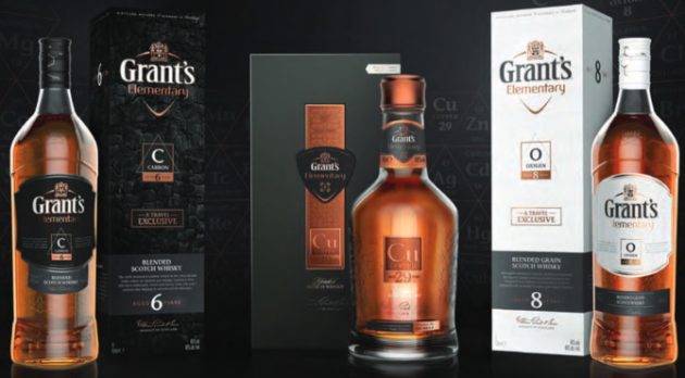
Developed specifically for the world’s lucrative GTR (Global Travel Retail) channels, the upscale Grant’s Elementary range of whiskies boasts a stunning packaging design for both primary and secondary packaging, developed by Webb deValm’s London office, making highly creative use of the Periodic Table of chemical elements to give each of the brand’s products a distinct unique personality with a high level of upscale elegance and sophistication targeting discerning and knowledgeable whiskey aficionados.
At its inaugural awards gala two years ago in Bonita Springs, Fla., the iconic Scottish whiskey and scotch distiller William Grant & Sons picked up one of the contest’s two first-ever Best of Show prizes with a stunning entry for the Grant’s Elementary range of whiskies produced exclusively for the so-called Global Travel Retail (GTR) channels, whose total sales were estimated at US$63.6 billion in 2016.
Developed by the U.K office of the global branding design services provider Webb deVlam, the six-month packaging redesign project involved taking the existing Grant’s packaging landscape and finessing it to address very unique requirements of the GTR retail environment.
“We had to be smart with the selections we used and how we dressed them up in order keep the project within budget,” recalls John-Paul Hunter, head of Design at Webb deVlam’s London office, “but the important factor here was not to see this as negative but as a creative challenge.
“It gave us some clear guardrails to work within,” Hunter explains, “and we had a positive working relationship with the production team to ensure that we could successfully execute our creative vision.”
Because the global whiskey industry is highly diversified and segmented in a multitude of categories defined by point-of-origin, aging process, blending techniques and many other differentiators, creating a unifying packaging theme while allowing for each product to shine on its own merit was a formidable and sweeping undertaking.
As Hunter relates, “Webb deVlam always approaches creative challenges from a consumer point of view, so we had to secure access to different airport retail environments, store managers and sales teams, as well as the consumers themselves.
“This gave unparalleled insights into how to create differentiated product appeal and how to visually catch the eye in the incredibly unique shopping arena,” says Hunter, describing the targeted consumer audience as adventurous and affluent jetsetters seeking an “enlightening” experience from their preferred brands.
Comprising the six-year-old Grant’s Elementary Carbon, eight-year-old Grant’s Elementary Oxygen, and the 29-year-old Copper blends, the new range brilliantly employed the Periodic Table of chemical elements as a core unifying theme “to celebrate the science behind whiskey-making,” he points out.
“Each age statement reflects that number in the Periodic Table and the material element is utilized in that particular product’s distilling process,” Hunter explains.
“So Oxygen is distilled under vacuum to create a crisper, smoother drink,” he relates, “while charring the inside of the oak barrels gives Carbon a distinctive smoky flavor.
“For its part, the exclusive 29-year-old, Copper celebrates the sacrificial copper rings which remove harshness to create unparalleled smoothness,” Hunter extols.
“Each product was visually nuanced with the right level of premium cues aimed at the following segments as part of a confident storytelling side-step that would consciously avoid the usual references to provenance and artisan craftsmanship,” says Hunter.
“By demystifying the storytelling around modern-day whiskey production, the brand appears transparent whilst promoting its innovative techniques,” he states.
“The Elementary range purposefully uses disruptive color-ways, finishes and age statements to create immediate shelf standout in the busy GTR channel,” says Hunter, noting that soon after its launch Grant’s Elementary won the Best-of-Show award in the highly prestigious Cannes Travel Retail Awards competition, garnering high praise for its inspired packaging excellence.
As he concludes, “Grant’s Elementary is a key piece of work in the continuing goal to make Grant’s a relevant option for today’s whiskey audience.”
Many cheers to that!
Advertisement