Celebrating the wonder of Wonder bread
By Canadian Packaging Staff
Design & Innovation branding and design agency Davis Flowers Foods George Weston Ltd. Grupo Bimbo Match Marketing The Hive Weston Bakeries Wonder Bread Zenith OptimediaWeston Bakeries brings back the timeless joy in a cherished icon.
Since 1921, Wonder bread has been appealing to the kid in all of us and continues to spark powerful memories that celebrate the simple pleasures in life.
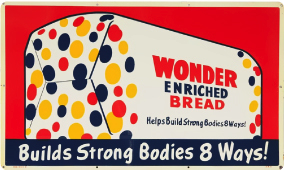
The original brand was inspired by The International Balloon Race in Indianapolis where the crowds were filled with wonder as hundreds of balloons in red, yellow and blue created a brilliant kaleidoscope of color in the sky. It was also one of the first breads to be sold pre-sliced back in 1930—and really, there’s not much better than sliced bread.
Nowadays, Wonder bread is sold in North American stores and produced by three distinct companies: in Canada by Weston Bakeries Limited, a subsidiary of George Weston Limited; in the United States of America by Flowers Foods; and in Mexico by Grupo Bimbo.
In Canada, Weston wanted to update the packaging of its iconic bread brand and challenged prestigious branding and design agency Davis to help it reclaim core equities to gain relevance with today’s families and millennial consumers.
 Located in Mississauga, Ont., just west of Toronto, Davis has 80+ employees working together to create leadership brands for clients that transform, connect and endure supporting North American and global brands, doing so for over 40 years.
In a category that has been increasingly dominated by nutrition messaging, Wonder needed to recapture the emotional connection with consumers.
Julia Kovacs, marketing director, Core Brands, adds: “Wonder carries a full line of nutritious white and whole wheat breads, yet it’s the carefree emotion and soft, pillowy texture that consumers associate with Wonder bread.”
Chris Plewes, creative director at Davis explains, “The redesign distills the brand’s core equities to its essence – color, softness and simplicity to break through the clutter of the bread wall.”
But how?
The design reclaims the white consumers associate with Wonder. Softness weaves throughout the new look including the softened wordmark and the gentle shape that houses the brand. The bubble graphics so ingrained in consumers’ memories still convey variety but have moved from functional carriers of information to fun symbols of the soft sandwich bread.
The addition of an interactive ‘squeeze me’ message on-pack is both playful and speaks to the brand’s freshness and soft texture. The overall clean and contemporary look brings Wonder into today’s market, without relying on retro or nostalgia cues.
Redesigned Wonder bread hit Canadian store shelves at the end of March, 2014. A new advertising campaign supports the launch with television and digital ads developed by The Hive; a multi-platform media strategy developed and executed by Zenith Optimedia, and in-store displays developed by The Hive and Match Marketing.
For information on Davis, visit www.davisdesign.ca.
Advertisement