Twice The Charm—May 2017, Canadian Packaging
By Andrew Joseph, Features Editor; Photos by Naomi Hiltz
Automation Design & Innovation Printing Colour Innovations Heidelberg Canada Graphic Equipment Limited Ltd. Masterwork Graphic Equipment Mitsubishi Heavy Industries Printing & Packaging Machinery Raining Communications slideshowToronto commercial print shop and its graphic design offshoot feed off each other’s success in the competitive marketplace
They say lightning never strikes in the same place twice, but as far as Carlo D’Onofrio is concerned, never say never is a more telling catchphrase in his line of work.
As owner of commercial printing press operator Colour Innovations and its sister company Raining Communications, a boutique agency of designers, writers, photographers and marketing strategists, D’Onofrio is a strong believer in the benefits of harvesting multidisciplinary synergies and creative talents of both enterprises from one single location to offer their corporate customers a true one-stop-shop solution for all their packaging needs—from design to production.
Sharing the roof of the same 30,000-square-foot production facility in north Toronto, the two complementary businesses are able to offer a unique one-two punch combination whereby the sum of its parts far exceeds their individual capabilities in terms of marketplace impact and respect.
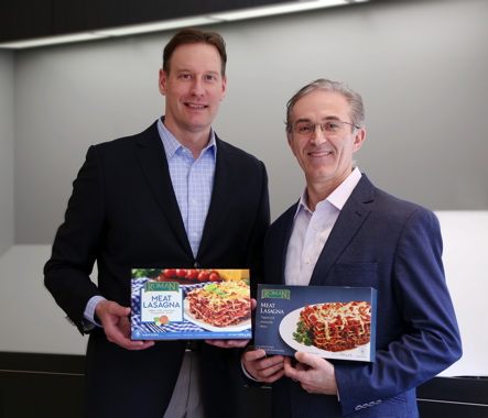
Holding the newly-redesigned Roman Meat Lasagna package, Raining Communications president Brian Hircock (left) stands beside Raining and Color Innovations owner Carlo D’Onofrio, who is holding the older package design it replaced.
As Raining Communications president Brian Hircock explains, “Having Colour Innovations operating under the same roof as Raining has enabled us to take package design to a new level.
“Our ability to combine the strength of expert design services with the experience of strong print business acumen allows for a more in-depth understanding of our customers’ business and vision of their brand,” relates Hircock.
Describing Raining as “an independently-operated agency within the Colour Innovations group of companies,” Hircock was brought in about two years ago by D’Onofrio to lead the boutique agency in expanding its customer base.
While Raining may currently lack in size compared to other more-established package design services providers in the market, “The positive side of that is that it makes us very nimble, so that we are able to partner up with customers and their brands in a meaningful way and to grow with them,” Hircock proclaims.
With direct access to the impressive printing capabilities and converting equipment operated by Colour Innovations next door, “Together we can provide our customers with a more complete end-to-end solution,” says Hircock, pointing out that Raining has full license to work with clients who may not require the print services offered by Colour Innovations, and vice versa.
That said, Hircock is happy to cite the example of Roman Cheese Products Ltd.—a privately-owned based food manufacturer of butter, cheese, dry and condensed dairy products in Niagara Falls, Ont.—as a happy customer of both companies.
Already a long-time customer of Colour Innovations, Roman Cheese recently hooked up with Raining on the advice of Colour Innovation’s account manager Jack Kouyoumdjian to help develop a new branding and packaging presence for the diary producer’s retail line of frozen lasagna products.
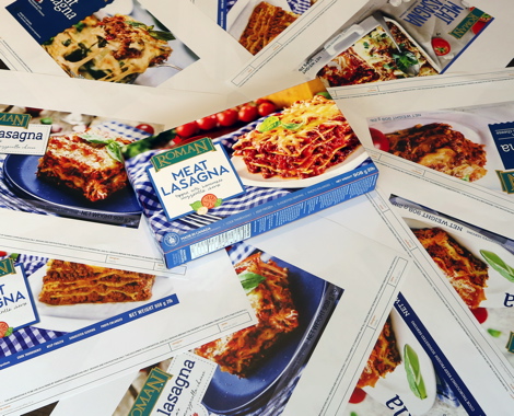
The redesign of the Roman Meat Lasagna food package necessitated a plethora of design options from Raining Communications, with the color of the gingham table cloth developing into a key feature in providing a defining visual cue for brand recognition and product variation.
“As we listened to the company’s ownership, we could tell that the company takes a huge amount of pride in its products,” Hircock recalls, “and we thought long and hard about how to make that pride shine through in the packaging of their product.”
With 15 different products comprising the entire line of Roman pasta recipes, Raining launched the project by first concentrating on creating a new design for the Roman Meat Lasagna recipe, with the aim of disrupting the category by offering consumers a truly exciting new option in the frozen food aisles.
“We made sure it had beautiful imagery, created by our photographic partner Steven Elphick & Associates, along with a clear descriptor of the product,” relates Hircock.
“We knew we had to add color coding—as existing packaging had none, to differentiate one flavor of the lasagna from another.”
Adds Raining’s creative director James Bailey: “For the consumer, an inability to find their favorite brand will lead them to find an alternative.
“It’s all about making the path to purchase easier for the consumer to find their favorite product,” says Bailey, noting that it was important not to change the brand’s appearance so much that a loyal consumer would not be able to recognize it on the shelf.
To that end, the existing Roman logo was kept, with a few nuanced changes.
“We updated the image by adding a brighter photo showing the pasta, cheese and sauce of the meat lasagna,” Hircock explains.
“We created a new visual signature for Romans Cheese,” he says, “with the differing gingham tablecloth colors being a defining visual prompt for the consumer,” says Hircock.
“The addition of the gingham really ties it all together to ensure that the consumer knows the product has a home-made feel.
“We’ve also added a flavor cue with a graphic under the brand name to show the customer what some of the ingredients are, and to imply that the ingredients are fresh—something Roman is quite proud of,” he states.
Because the package redesign includes a new photographed version of the plated lasagna, Bailey says the design team decided to utilize a line drawing of the flavor cue to avoid visual clutter and overkill.
“This is something that we can alter depending on what fresh ingredients Roman wants to show the consumer with a given recipe,” he relates.
“Using a flavor cue graphic tells the consumer so much, but then we can add secondary copy to tell the consumer more,” says Bailey.
Adds Hircock: “The new package is no longer a story of what the product is, but rather a story of why the product is.”
Bailey and Hircock both agree that the wording on the package should match the quality of the graphics.
“We want to ensure that whenever a consumer touches your brand, that the brand’s message is consistent,” says Bailey.
“A lot of times a brand owner may have someone designing their website, someone else designing the logo and someone else designing the packaging,” he notes, “and when you put it all together, the consumer can really start to wonder about who the brand is.
“So even though we may not develop the website, we do want to be involved to ensure that the same consistent message is being imparted through the packaging we create for the brand.”
After the customer has approved the new package design, it is quickly forwarded to Colour Innovations to discuss the project’s technical feasibility.
According to Kouyoumdjian, the company has come a long way since its early days in 1998 as a simple prepress service provider supplying the design community with basic scanning, retouching, color correction and film output services.
“Since moving to our current facility in 1996,” he relates, “we have evolved into a fully state-of-the-art plant offering CTP (computer-to-plate) technology, FM (stochastic) screening, digital photography, digital asset management/ad delivery/remote proofing, and digital communication with clients via T1 lines/FTP.”
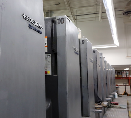
One of the printing presses used by Colour Innovations is the Heidelberg Speedmaster 102 11-color, 40-inch prefector press, a hard-working machine that produces the high-quality product that has helped make the printing company a well-respected force in the industry.
To print the packages and other products, Colour Innovations employs a six-color (plus coater) sheetfed, 40-inch Mitsubishi press, along with the Heidelberg Speedmaster 102 11-color, 40- inch perfector press.
With a recently-formed new Direct Mail division also residing on the climate-controlled premises, the printer’s comprehensive range of high-quality services enabled it secure a contract with national carrier Canada Post, no less, to produce secure, speciality print for the Crown Corporation.
“It’s a fairly difficult job,” says master printer and Colour Innovations partner and technical support manager of print Steve Kendrick (see image top of article), “but it’s one that Colour Innovations is able to handle expertly well” with its 11-color Heidelberg Speedmaster 102 perfector press.
“Not many printing press houses in Canada have the capability to run a 10-micron F.M. screen,” relates Kendrick, “but we have found the perfect harmony between the substrate and the Heidelberg to create a superior quality product.
Capable of reaching speeds up to 12,000 sheets per minute, the high-end Speedmaster 102 commercial print press uses an eccentric perfecting drum to reduce contact to the freshly-printed sheet of substrate, according to Heidelberg, resulting in better air circulation, improved perfecting register at high speeds, and reduced wash-up times.
Moreover, the Heidelberg machine’s PerfectJacket Plus a perfecting impression cylinder jacket further reduces wash-up times with its ink repellent properties and improves perfecting quality, and its improved surface characteristics improve the press’ performance on coated papers with high ink densities.
“The overall benefit is a 50-percent reduction in cleaning requirements and improved perfecting and sheet transfer quality,” says Kendrick.
“It’s a wonderful machine,” says Kendrick. “Not only do we use it for postage stamp production, but also to print magazines, CD and DVD liners and booklets, and high-quality brochures for our customers in the automobile industry.”
According to Bailey, “The ability for Raining to be able to sit down with Steve Kendrick and Carlo D’Onofrio—both well-experienced hands in the print industry allows us to modify our design to ensure it works well with the printer.
“Colour Innovations helps us improve our end game, and you can’t ask for more from a partner,” says Bailey.
For its part, the aforementioned new Roman Meat Lasagna box was printed in a four-color process on the 20-year-old Mitsubishi printing press that has proven to be a highly-reliable and durable workhorse for Colour Innovations.
“The only difficult aspect is that the packaging uses a waxy freezer board substrate that requires a specific coating added to it to prevent moisture from a fridge or freezer attacking the box and collapsing it,” Kendrick recalls.
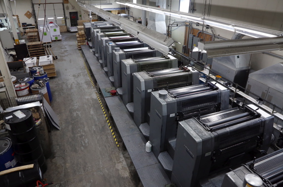
A birds-eye view of the Heidelberg 102 Speedmaster printing press housed at the 30,000-square-foot facility Colour Innovations shares with Raining Communications.
Other high-end equipment at the facility includes a Masterwork Graphic Equipment MK 1060 ST die-cutter and foil-stamping press purchased two years ago, hailed by Kendrick as “one of the best purchases we ever made.
“It’s incredibly user-friendly, and with the amount of foiling we are being asked to apply by our customers these days, it’s a necessity,” Kendrick explains.
“It’s all about keeping our customers happy.”
Owner D’Onofrio full-heartedly agrees: “It’s a challenge, it’s stressful, but at the end of the day it’s very gratifying to see the quality of work we produce here.
“It’s not just about money: it’s about the quality of the product that makes our customers so happy,” he concludes.
“We really are passionate about our work, and it shows in our day-to-day performance.”
Advertisement