Feelgood packaging a real standout
By Megan Moffat
Design & Innovation General Sustainability Amola salt Checkout JOCO Coffee Cup Megan Moffat Rebels Refinery Sea to Sky Seasonings Taza Chocolate Mexicano Sampler Wealth of Man soapA monthly look at some of the hits and misses in the packaging world from the viewpoint of Joe Public, Canadian Packaging magazine’s revolving columnists.
Modern consumers are really overwhelmed with the abundance of choice and information that goes with it.
From company messages to lists of ingredients and catchy slogans, packaging has become loud, overcrowded and complicated— prompting consumers like myself to keep an eye out for something that conjures up the feelings of nostalgia or handcrafted warmth.
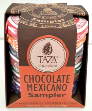 The Taza Chocolate Mexicano Sampler is an inspired example of quality and authenticity conveyed through packaging. Handcrafted and made with real ingredients, Taza Chocolate comes in a handy die-cut folding carton holding a stack of eight disc-shaped Mexican chocolates of different enticing flavors to create an eye-catching presentation of the colorful paper- wrapped treats, suitably enhanced with clear messaging to inform the shopper about the stone-ground process used to make the chocolate, the reasoning behind each of the eight bold flavors, and the noble social causes that the dairy-free, soy-free and vegan chocolate brand actively supports. Proudly boasting the authoritative USDA Organic, Direct Trade, Gluten Free, Kosher Pareve and Non-GMO Project Verified certifications, the product deftly employs playful graphics on each individual wrapper to denote the taste profile and to inform consumers how to enjoy the products—either as a snack or as a delicious Mexican-style hot-chocolate beverage—with a recipe inserted just underneath the paper wrap. The interactive packaging not only celebrates the socially conscious brand, but also tells a real feelgood story in a straightforward and honest way.
++++++++++
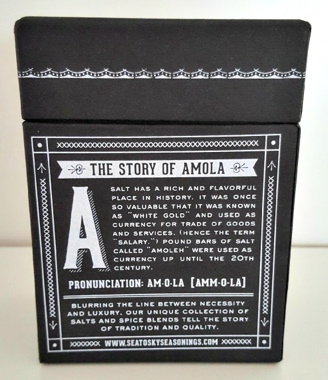 The same goes for the Amola brand of salt marketed by the Vancouver-based Sea to Sky Seasonings, Inc., which explicitly sets out to “blur the lines” between necessity and luxury,” as stat- ed on the classy craft-box using bold white lettering and a sleek back palette to relay its message of historic inspiration. While today’s consumers may well take salt for granted, there is a reason that this everyday staple was once called “white gold” for centuries by traders and merchants of the day, with one-pound bars of salt often used in lieu of existing currency. Relaying this information in thoughtful, engaging manner right on the front of the retro novelty package in a fusion of old and new is a credit to the brand’s marketing savvy, underscored with helpful recipe suggestions ranging from steak-and-mushrooms to the more adventurous camp-fire culinary creations.
++++++++++
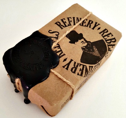 No stranger to vintage-inspired packaging, Toronto-based natural skin-care products distributor Rebels Refinery cleverly plays up the dandy appeal of its Wealth of Man brand soap bar with a depiction of a suit-wearing gentleman with a classic top hat ready to step out for a stroll on the town. The brown paper packaging is twine-wrapped and wax stamp-sealed to create an ornately old-fashioned package that actually makes plain brown paper look really hip with its tongue-in- cheek graphics and a witty product slogan on the back of the pack that proclaims, “You may not always be a man of wealth, but you can always be a goddamn wealth of a man.” With a brief list of easy-to-pronounce natural ingredients, and a pledge to donate two per cent of all sales to charitable organizations for mental and physical health, the package is a perfect fit for a premium product targeting well-groomed men who want to look good and also feel good about their purchase.
++++++++++
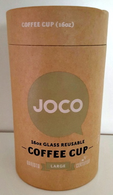 Although growing numbers of consumers appear to be paying attention to more environmentally sustainable packaging options nowadays, there is no harm in reinforcing the message on the pack- aging itself, like the JOCO Coffee Cup traveling mug—made from recycled glass—has done with a distinctive, 100-percent recyclable, round paperbox cylinder offering plenty of helpful hints on the back on recycling and personal carbon-footprint reduction.
 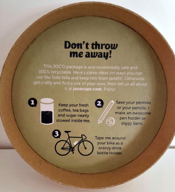 With a direct “Don’t throw me away” plea to the consumer printed underneath the lid, the package actually offers helpful graphic suggestions for consumers to repurpose the cylinder: use it to store coffee; as an alternative piggy bank; and even as “a snazzy bottle holder for your bike.” It’s always neat to see products having fun with the package, even when conveying a message of profoundly serious importance.
 Megan Moffat is a Toronto-based freelance writer working in the film and cinema marketing industry. This article can be found in the March 2016 print edition of Canadian Packaging magazine.
Advertisement