Spring forth with eye-candy packaging
By Yoko Asada
General beer Cadbury Adams Checkout Colgate-Palmolive Canada Donkey Products Fabric Softner gum Koyama Honke Shuzou Co. Mouthwash Procter & Gamble (P&G) Sake Sapporo Brewing Company Sleeman Breweries teaJoe Public speaks out on packaging hits and misses.
It may have been a long time in coming, but one look out the window will tell you that spring has finally arrived. The signs of renewal are displayed everywhere in the blossoming flowers, the budding tre es, and large groups of people who have crawled out of their winter cocoons to stretch their legs and discover a world reborn.
One thing that always strikes me about this time of year is how our sense of smell seems to be reborn as well. Truly, our olfactory sense holds an incredible power over how we feel at any time of the day.
It can tantalize us with sweet smells, alert us to a culinary catastrophe, or evoke powerful memories from the past.
That’s why I believe that a truly complete package should always try to convey the ability to engage our sense of smell on some level—be it literally or figuratively.
I think many people will agree that few things smell better than freshly laundered bed sheets. For years, fabric softeners like Fleecy from Colgate-Palmolive Canada Inc. have staked their very image and reputation on rewarding consumers with this extraordinary scent.
On a personal level, the blue, white and pink color palette used by the company on the package instantly evokes the popular Japanese pastime of sitting down and enjoying fresh air under cherry blossom trees, with a clearblue sky arcing majestically overhead.
If my sheets smell even half as well as the packaging makes them look like they will, I may never leave my bed again.
I also like the Fleecy brand’s recent upgrade to a new 25-load, 850-ml squarish container whose smaller footprint naturally allows me to store even more cleaning products in my space-challenged kitchen cupboard. While any noticeable packaging change is a leap of faith to some extent, even for well-established brands, this is one packaging upgrade that seems to have sweet success written all over it.
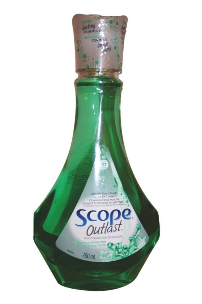
Fresh breath is one area of personal hygiene with no room for compromise or cheating in this corner, so I was quite excited to see the newly reformulated and repackaged Scope Outlast brand of mouthwash from Procter & Gamble Inc. (P&G) hit the store-shelves in recent weeks.
Not only does the product loudly proclaim that the new “lasting” formula will help keep my breath fresh up to five times longer than before, the spectacular new, decanter-like 750-ml plastic bottle is a real breath of fresh air in a product category that has grown a little old in the tooth lately in terms of true packaging innovation and flair.
Exuding real panache that makes it look like something that naturally belongs in Jennifer Aniston’s medicinal cabinet, this high-end mouthwash is not only pure eye-candy, but also a compelling example of the virtues of incremental improvement, thanks to a cleverly-designed lid accented with three points on the end that prop the cup up when stood up on its end—acting like a pedestal of sorts for the minty mixture—to make this high-end mouthwash really feel worth every extra penny.
……….
Maybe it’s a little case of paranoia or extreme selfconsciousness, but I’m a strong believer in a multilayered plan of attack when it comes to halitosis, which is I will rarely allow myself to get caught out in the public without a pack of chewing gum, my trusted sidearm. 
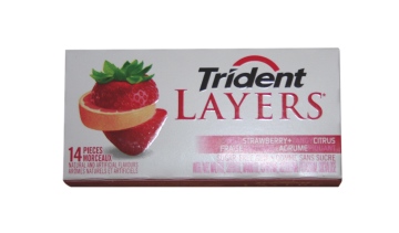
While it’s true that any old gum will work in the time of need, I have recently developed a real fondness for the new Trident Layers packs from Cadbury Adams.
Like many other gum producers in recent years, the company has gradually moved away from the paper-based soft-packs—today offering its newer products in the rigid, foldout paperboard cartons, with the strategically-positioned wraparound flap at the back panel allowing consumers easy access to the product, while keeping its contents admirably safe and secure.
Even if the pack did manage to unravel in one of the deeper regions of my purse, I won’t find any sticks of gum straying too far from they should be—thanks to the thoughtful use of small dabs of food-grade adhesive that keeps each piece securely in its proper place.
The Trident Layers pack also effectively sets itself apart from other competing products through its eye-pleasing color scheme. Whereas dark and solemn package graphics seem to be the ongoing trend in the gum sections at the stores these days, this tidy slider-pack utilizes a simple white background to show off some adorably cute layered fruit graphics—strawberry chunks on top and bottom with a slice of orange sandwiched in the middle—to relate the product’s story.
……….
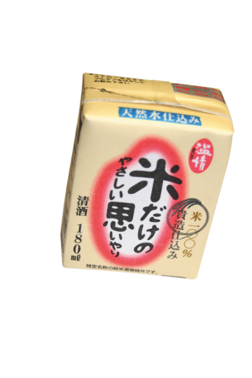
 Many people trying Japanese sake for the first time are largely unmoved by the experience—finding little flavor or smell to either commend or condemn the exercise—but for those of us taught all the different subtleties of this rice-based alcohol, truly savoring sake is much more than simply knocking back an offbeat-tasting shooter.
However, there is vary little subtlety or nuance to be found on the 180-ml boxes of Komedakeno Yasashii omoiyari—literally translating as “compassion made by rice”—from Japan’s Koyama Honke Shuzou Co. While there is something to be said for the foresight of attaching a straw for the benefit of consumers not having a sake cup on hand when they want to take a nip, this “sake in a juice-box” package is considerably let down by flat, uninspired and lackluster packaging graphics, just when a little more creative flair is exactly
what was required to make this package a little less “square,” as it were.
……….
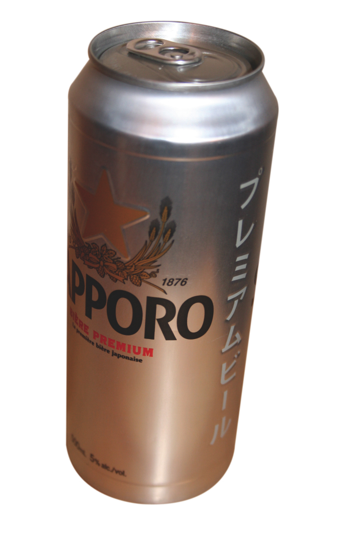
Conversely, the new 500-ml aluminum cans of Sapporo Premium Beer from Sapporo Brewing Company, filled at the Sleeman Breweries Ltd. beermaking plant in Guelph, On t.,
t.,
offer a glimpse of the best that modern Japanese package design has to offer—raising the whole canned “beverage experience” to a whole new level with its silky smooth feel, an embossed golden star in the middle of the brand’s logo, and a crisp line of Japanese katakana lettering down the side, which simply says “Premium Beer.” Kanpai! (that’s “Cheers!” in Japanese) to Sapporo Brewing for keeping its creative juices in fine shape to create such a premium looking example of instantly memorable package design that resonates with beer-lovers everywhere.
……….
The creative minds of novelty products distributor Donkey Products Gmbh & Co. of Hamburg, Germany, sure know the way to stir up a little fun and excitement at your next tea party. Paying a playful tribute to some of the world’s most notorious dead rock and pop stars—including Elvis Presley, Bob Marley and Michael Jackson—the company’s rather provocative Sex, Tea & Rock’n Roll set of five novelty tea bags feature s cleverly caricaturized music idol icons come stapled to standard tea-bags, replacing the traditional pieces of string with something that is far more likely to kickstart a conversation among tea-sipping friends. As the graphics on the front of the outer packaging show, the arms of each icon latch on to the rim of your teacup—as if to hang out with you as you suck back the ambrosial beverage. Just be warned: if the Jimi Hendrix tea-bag starts emitting a mysterious Purple Haze of some sort, just play it safe and steer clear of it!
 Yoko Asada is a freelance writer and translator living in Toronto.
Advertisement


