
Pentawards 2012 winners
By Canadian Packaging Staff
General Advanced Ice Cream technologies Bardot Coca-Cola Diet Coke Etude Good! Hands Up Landor Associates San Francisco Nescafe My Cup Pentawards 2012 Phoenix Communications Springetts Brand Design Consultants Turner DuckworthThe most beautiful packages of 2012 named at Pentawards 2012 - Diet Coke big winner.
The winners of Pentawards 2012—the most beautiful packaging designs in the world—were announced on October 4, 2012 in Paris, France.
The prestigious Diamond Pentaward 2012 Best of Show was won by Turner Duckworth (London & San Francisco), for the design of Diet Coke.
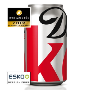 Diet Coke is the number two soft drinks brand in the USA. And leaders need to be innovative. Coca-Cola commissioned the redesign of Diet Coke to the Turner Duckworth agency. The bold result revolves around the letters D and K, the key elements of the brand. The tight framing and original logo gives a graphic identity that is also very successfully used on the point-of-sale (POS) equipment and in advertising.
First introduced as a limited edition in late 2011, the design of the can, the overpacks and the various forms of advertising and brand presence has been so popular with consumers that, since September 1, 2012, Coca-Cola decided to use this remarkable design permanently.
The Platinum Pentawards crowning the best in packaging in five major categories are allocated to:
Beverages Category:
Phoenix Communications (South Korea), for Nescafé My Cup
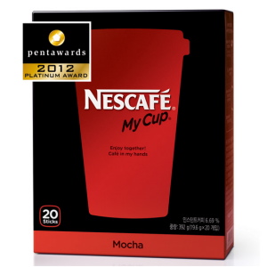 The Nescafé brand is relatively new to the South Korean market. It must therefore rapidly appeal to consumers (the target is young) and become a market leader. It is through graphic simplicity that Phoenix resolved this challenge, using the traditional coffee cup and lid as a symbol of Nescafé brand recognition. Always presented on a black background, which implies a high level of quality, the cup comes in different colors depending on the type of coffee. A slight gradient in the colors reinforces the design. The always white Nescafé logo lights up the design. This style is simple and easily adaptable to a variety of forms both in communication and on the sales materials and coffee machines.
Food Category:
Springetts Brand Design Consultants (United Kingdom) for egg packaging « Eggs For Soldiers »
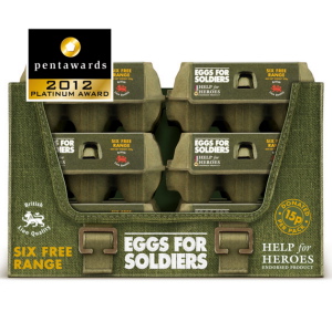 How to launch a new brand of eggs? The idea is simple: break from tradition.
First, play on words (in the United Kingdom, the word “soldiers” is used for fingers of bread which are dipped in the yolk of a boiled egg).
Then, have an agreement with the charity “Help for Heroes” which helps British soldiers who are injured, disabled or ill.
Finally, use the distinguishing graphic elements of the army: khaki color, rugged canvas, military trunks for grouping boxes, shape of decorations …
The result: an original and attractive packaging design, an innovative brand presence, a unique positioning, an extensive press coverage … in short, a battle won and more than £250,000 (~Cdn $400,000) donated after a few months to the charity.
Body Category:
Etude (South Korea), for Hands Up, a range of deodorants and hair removing products.
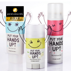 The Hands Up range is aimed at 16- 22-year-old girls and is mainly sold in South Korea and Japan, but also in 11 other Asian countries. It is obviously by lifting one’s hands that the effectiveness of these products can be noted. The designers of the Study House company (cosmetics manufacturer) played with this gesture by putting a small pair of arms on the packaging, which is very attractive to young customers of the brand. Such a simple but expressive idea which gives the brand its peculiarity and originality.
Markets Category:
Good! (Kazakhstan) for a package of rubber boots for fishing.
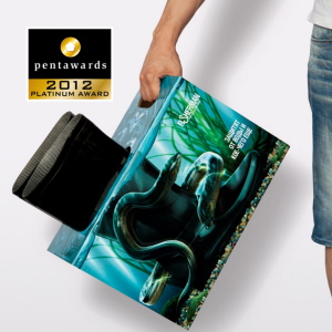 Rubber boots are in many ways an underestimated product. Everyone knows their main purpose (to shield one’s feet from the water), but market players do not communicate on the characteristics of the product, being generally content with just packing them in a box donned with a logo. Good! – the packaging design agency from Kazakhstan – has chosen a different approach, one of realistic packaging illustrating the boots on location, feet in clear water surrounded by fish and eels. Designed as a small display case, this packaging breaks with tradition and makes an ordinary product rather sexy. A remarkable creation!
Luxe Category:
Landor Associates San Francisco (USA) for their Bardot ice-cream packaging.
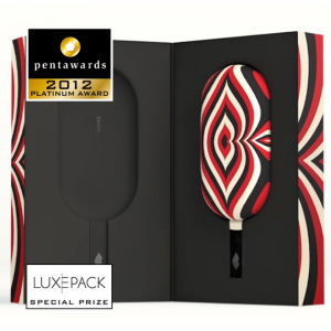 The Mexican company Advanced Ice Cream Technologies aims to position its products as the best and most luxurious ice creams available. Landor Associates San Francisco was selected to create the brand, its name, its design, packaging, communication material, and of course the design of the ice cream bars themselves.
Given suggestive names (“Forbidden Fruit“, “Acapulco Love“, “Heart of Darkness“, or “French Kiss“), Bardot ice creams are packaged in specific wrappings which preserve them for up to eight hours.
The result: Bardot and its ice-creams with resolutely innovative looks, elitist graphics, sexy design. Haute couture ice creams in very classy packages, in luxurious boutiques designed by Ana Henton …
In addition to its Platinum Pentawards, Landor Associates in San Francisco won the special prize offered by Luxepack, the international exhibition dedicated to luxury packaging.
A list of all winners may be found at www.pentawards.org.
Advertisement

