Be it art, nature or fashion—everything you look at looks better through fresh lenses.
And better still when your eye-cleansing solution comes in a clear see-through, convenient and fully-recyclable container used by eye-care specialists Bausch + Lomb to package its newly-relaunched renu fresh (formerly ReNu MultiPlus) multipurpose saline solution, impeccably formulated to give contact-lens users a fresh lens feeling everyday.
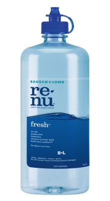
Produced and packaged at Bausch+Lomb’s manufacturing facilities in Greenville, S.C., the renu fresh bottles—retailing in Canada in 60-, 240-, 355- and 480-ml sizes—are blowmolded from a healthcare-approved grade of PET (polyethylene terephthalate) and transported directly to a cleanroom, where they are packed and shipped to the company’s Canadian operations in Vaughan, Ont.
Developed in partnership with leading rigid-plastic products manufacturer Amcor Rigid Plastics, the new clear, and reproduced on the bottles are spruced up with elegant graphics developed by the London, U.K.-headquartered package design specialists Pentagram and reproduced on the clear wraparound labels supplied by CCL Label, with and the neckbands are provided by Safety Seal Plastics supplying the tamperproof neckbands.
“We wanted an innovative, new look that would help renu fresh stand apart from the competition, while also maintaining our current brand recognition, explains Patrick Leu, lens care product brand manager for Bausch+Lomb Canada.
“Part of the new look includes an actual photograph of a wave wrapping the renu package, as opposed to an image or drawing often used by competing products to allude to water, and simple typography clearly indicating the product name and benefits,” says Leu. “The new renu logo is clean, modern and simple – stacked on two lines and hyphenated with a water drop.
“To compliment the clear bottle’s see-through look, we also replaced the previous white label with a clear polyolefin , pressure-sensitive label,” adds Leu. “Our goal was to develop a new package that would clearly communicate our distinct product benefits: the feeling of wearing a fresh pair of lenses every day, and the cushion of moisture between your lenses and eyes that you get with renu fresh. It’s a simple reminder for consumers that everything looks better through fresh lenses.
“Most importantly, the bottle is made with healthcare-approved grade of PET—making it more environmentally-friendly and 100-percent recyclable.”
Pointing out that the renu fresh product uses no colorants typically found in most competing products, Leu says the product’s consumer convenience attributes are also greatly enhanced with the proprietary Cushion of Comfort feature, which is said to be specially formulated to work with natural tears to create” a cushion of moisture between your lenses and eyes.
“It is proven to clean lenses, remove protein build-up, and is unsurpassed at fighting germs – giving you that fresh lens feeling every time,” Leu enthuses. “By marrying beauty and function, I believe the redesign of renu fresh is truly changing the contact lens solutions industry, which has been dominated by the ever-present, and sometimes confusing, white-bottle/white-label design.
“It is currently the only clear bottle in the lens-care category in Canada,” sums up Leu, “and it’s truly unique in a sense that it allows consumers to see when they are running low on solution—both a functionality and a convenience benefit.
“And although the product has only been available in Canada for a short period of time, we have already started to receive positive feedback on the benefits of this simple change.”
For more information, visit www.renu.ca.
Advertisement