Spring Forward With Packaging Eye-Candy – Canadian Packaging, April 2014
By Megan Moffat, Checkout Columnist, Canadian Packaging
Design & Innovation Cactus Verde Clear Hills Honey Company DAVIDsTEA ForlifeDesign Illume Natural Beeswax CrayonsA monthly look at some of the hits and misses in the packaging world from the viewpoint of Joe Public, Canadian packaging magazine's revolving columnists
As we cross our fingers in hope that the long Canadian winter months are finally behind us for real, it’s hard to escape the annual return of new packaging colors, slogans, designs and graphics trumpeting the long-awaited springtime warmth and renewal. After the cold weather has taken its heavy toll on our outdoor activities, social events and even our bodies, a celebratory cup of tea is often a good idea around this time of the year. It’s also a good time for quick-thinking companies like the Montreal-based tea importer DAVIDsTEA to really rise to the occasion by launching wonderful new products, such as An Island Getaway tea-time set that will have tea purists purring with delight.
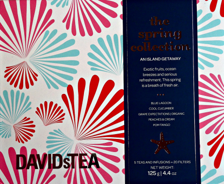 Part of the company’s popular The Spring Collection brand, the five-blend assortment of loose-leaf teas—resting inside a bright paperbox covered in super chic graphics of seashells set against a tranquil coral-toned background—virtually sells itself by listing its exotic Blue Lagoon, Cool Cucumber, Peaches and Cream, Grape Expectations and Pom Tango blends right upfront in plain ‘can’t miss’ view, just below an enticing sales pitch positioned underneath the classy, silver-foiled brand logo. This commendable packaging finesse is aptly matched by the folding carton’s built-in, slide-out compartments containing each of the five flavors in its own silver pouch—each boasting not only the blend’s name, but also the optimal serving and seeping instructions. As a beautiful gift or a personal treat, this high-end box is a packaging metaphor for all that’s good about this time of the year.
******************
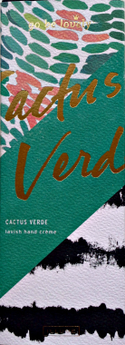 Along the similar lines of personal gratification, the Cactus Verde brand of hand lotions from Illume boldly advises the consumer to “go be lovely” with a gold-foiled tagline near the top of a beautiful upright box brandishing a thick, diagonal cactus-green line surrounded by leaf-like patchwork on upper-left and zebra stripes on the bottom right. The disarming warmth of crafty packaging graphics makes a telling statement on the virtues of ‘animal cruelty-free’ beauty products without bashing the consumer’s head in with heavy-handed messaging. Made from an eclectic mix of 100-percent natural ingredients ranging from mango butter to wild geranium, this luxurious formulation is naturally pricier than your conventional run-of-the-mill hand lotions, but well worth the double reward of grooming indulgence and a guilt-free conscience, along with a well-communicated assurance that it is perfectly okay to treat yourself, really!
************
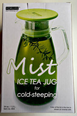 For some new products, good spring packaging extends beyond just colors, personal touches and clever slogans to using fairly detailed product information to catch the consumer’s fancy. And it certainly works wonders for ForlifeDesign’s new Mist Ice Tea Jug container designed specifically for cold tea steeping.
Packed inside a sturdy paperbox featuring a large image of the jug in action on the front panel, the box reveals everything you need to know about the jug—including care and warning instructions—on the back panel with the aid of helpful ‘how to’ diagrams. 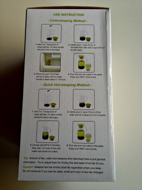
The information displayed there eliminates the need to add any extra inserts, pamphlets or other paperwork inside the package, whose backside tells consumers all about the jug’s borosilicate, hand-blown glass construction, a heat-resistant polypropylene lid, and other special features that made my search for a new ice-tea jug so short and sweet.
**********
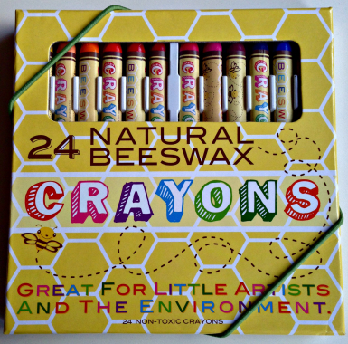 Spring-inspired packaging is not for adults only, as vividly illustrated by the new pack of Natural Beeswax Crayons from the U.K.-based Clear Hills Honey Company.
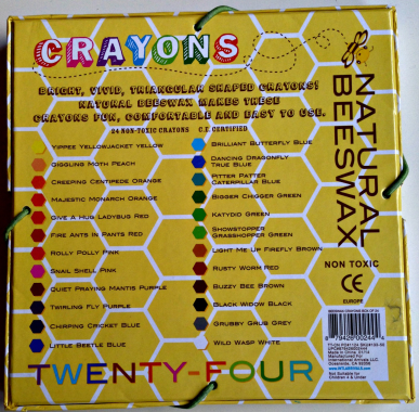 With bright splashy colors and tongue-in-cheek design of a honeycomb-patterned, two-piece box sure to catch the eye of kids and parents alike, the package employs two snug-fitting elastics around two opposite corners to help keep the crayons in place when not used—a handy little safety feature well befitting the organic, nontoxic crayons bearing zany critter-themed names such as “Brilliant Butterfly Blue” and “Showstopper Grasshopper Green,” among other like-minded puns listed on the back panel.
With an adorable slogan proclaiming the crayons to be “Great For Little Artists and the Environment,” it’s a textbook example of an innovative product effortlessly selling itself through clever, irreverent and light-hearted packaging execution.
Megan Moffat is a Toronto-based freelance writer working in the film and cinema distribution industry.
Advertisement